Transforming LITA’s Digital Identity
How my UX and Web Development Skills Transformed a Non-Profit’s Website
Role: UX Researcher/Designer | Web Developer | SEO/CRO Strategist
Tools: Figma, Wix, Google Suite, SEMRUSH
The Challenge
LITA’s website lacked intuitive navigation and emotional connection, preventing visitors from understanding its mission and supporting its programs.
The Solution
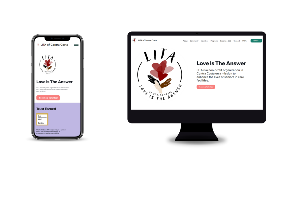
I led UX research and co-developed a responsive website that improved navigation, inspired action, and increased engagement through design and storytelling.
Results at a Glance
🧭 Simplified navigation made it easier for visitors to find volunteer and donation pages.
🎨 Stronger brand identity created a warmer, more human connection with the community.
📈 Improved local visibility through optimized pages and a verified Google Business Profile.

My Role in the Project
I collaborated with LITA’s director to understand the organization’s goals, audience, and brand identity. My work combined UX research, content strategy, design, and development to create a user-centered website that strengthened community engagement and donor support.
Research & Strategy
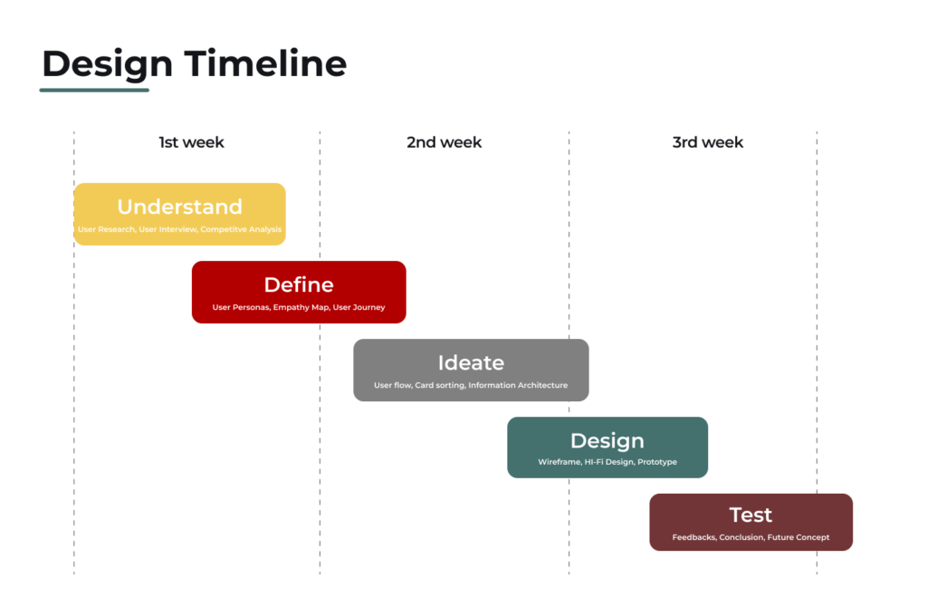
Conducted user interviews and competitor analysis to identify pain points and opportunities for higher volunteer visibility.
Created personas and a site map to align navigation with donor and volunteer needs.
Defined brand positioning and content tone to communicate LITA’s mission clearly and authentically.
Design & Development
Designed wireframes and mockups with clear hierarchy, spacing, and interaction cues to improve readability and flow.
Conducted feedback sessions with LITA staff and volunteers to refine layouts, calls-to-action, and form usability.
Applied UX principles of simplicity, clarity, and empathy to strengthen emotional connection and engagement.
UX & UI Design
- Built the final website in Wix, translating Figma prototypes into responsive, accessible pages.
Structured navigation and links to guide users toward volunteering, donating, and learning about LITA’s mission.
Established a visual system with cohesive colors, typography, and imagery that reflected the brand’s warmth and values.
SEO & Optimization
Created and verified the Google Business Profile to support local visibility and engagement.
Added page titles, meta descriptions, and alt text to strengthen discoverability in local volunteer searches.
Configured Google Analytics 4 and Search Console to track visibility, engagement, and performance metrics.

How the Website Looked Before
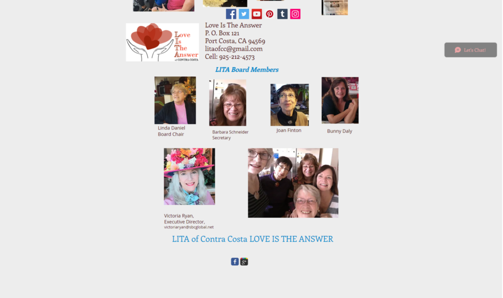
LITA’s original website was outdated, text-heavy, and difficult to navigate. Key pages like Volunteer and Donate were buried in menus, and the overall layout lacked hierarchy and emotional tone. The design didn’t reflect the warmth of the organization or make it easy for users to take action.
Homepage

Volunteer Page

Donate Page

Contact Page

Results & Impact
The redesign and research process transformed LITA’s online experience by improving navigation, visual consistency, and community engagement across all touchpoints.
Improved Navigation and Usability
Reorganized the site map and menus to help visitors quickly reach volunteer, donation, and program pages.
Simplified page layouts and navigation labels, creating a smooth and intuitive browsing experience.
Stronger Brand Identity
Built a visual system with warm colors, clear typography, and authentic imagery that reflected LITA’s values.
Strengthened credibility and recognition by aligning design, tone, and messaging across all pages.
User Engagement Growth
Designed and tested multiple layout variations to identify the most engaging and accessible structure.
Simplified calls-to-action and forms to encourage more sign-ups, donations, and returning visitors.
Research-Driven Design Process
Conducted 30 user interviews and created personas to understand audience motivations and goals.
Used testing feedback and journey maps to shape structure, layout, and messaging decisions.
Improved Local Visibility
Optimized page titles, descriptions, and content to strengthen LITA’s visibility in local search results.
Created and verified a Google Business Profile to increase reach within the Contra Costa community.
Client Empowerment
Kept the website on Wix to maintain familiarity and prevent confusion for the LITA team.
Structured the site for easy updates, allowing staff to edit pages, images, and events without outside support.
Hear From my Partner
"Working with Ponce on the LITA project was an incredible experience. As the Lead UX Researcher, Ponce’s ability to extract meaningful insights from user interviews and translate them into actionable design decisions was impressive. His dedication to ensuring the website reflected user needs while aligning with the non-profit’s mission was key to our success. Ponce’s leadership and technical skills were instrumental in creating a fully functional, user-centered website that is set up for growth and impact."
- Myles L. @ UI Designer and Co-developer at LITA

Hear From the Owner
"Our LITA of Contra Costa website was homey but so confusing.
Then, Ponce and Myles stepped in to do an amazing overhaul and brought us into modern times with comprehensive tools for what best makes a website work. We are grateful for all the help we are receiving for this 44 year old non-profit, whose mission is to alleviate loneliness and improve quality of life for disabled seniors in Contra Costa Nursing Care facilities with innovative volunteer programs including music, gardening and pet visits."
- Victoria Ryan. @ CEO at LITA of Contra Costa

What I Learned
This project was more than a design challenge. It was an opportunity to create something that truly supported a community. Working closely with LITA’s director, I learned how design can help amplify the mission of an organization and make a real difference for the people it serves.
Leading the UX research taught me the importance of listening first. Every interview and user insight helped shape a website that not only looked better but also felt more human and welcoming. Collaborating through each stage, from planning to launch, reminded me how essential communication and empathy are in any successful project.
The biggest takeaway was not just the improved website or stronger engagement metrics. It was seeing how design, when guided by purpose, can connect people and inspire action. This project reinforced my belief that great UX is about understanding people first and using that understanding to create something meaningful.
