Transforming the National Park Service’s Digital Experience
Enhancing Usability, Accessibility, and Visual Design for Modern Visitors
Role: UX Researcher/Designer
Tools: Figma, Google Suite, Zoom, Trello, Instagram
Duration: June 2024 - June 2024 (2 Weeks)
The Challenge
The National Park Service (NPS) website needed a complete redesign to improve user experience, modernize the interface, and enhance accessibility for a diverse range of visitors. The original site was cluttered and difficult to navigate, leading to user frustration and disengagement. Mobile accessibility was especially poor, further limiting the effectiveness of the site for users on-the-go.
The Solution
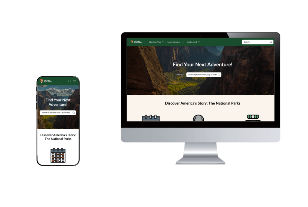
In this solo UX/UI project, I conducted user interviews to identify pain points and needs, which guided the redesign to create a more accessible, engaging, and visually cohesive digital experience. Key improvements included streamlined navigation, enhanced accessibility, and a consistent visual identity that aligned with the NPS brand.
Results & Impact
Improved Navigation
Streamlined the user journey, enabling visitors to easily find park information, book services, and plan trips, enhancing overall usability.
Enhanced Accessibility
Implemented WCAG standards to ensure the website is accessible for visitors with disabilities, fostering a more inclusive digital experience.
Visual Consistency
Developed a cohesive, modern interface aligned with the NPS brand, enhancing user engagement and creating a visually pleasing experience.
Scroll down to dive deeper into the process
Process Overview
1. Research
Conducted interviews and competitive analysis to understand the user needs and pain points.
2. Define
Identified project goals to guide a user-centered approach focused on accessibility and ease of navigation.
3. Ideation
Developed solutions based on research, aiming for an intuitive, engaging design.
4. Design
Created prototypes that refined user flow, navigation, and visual design.
Heuristic Evaluation
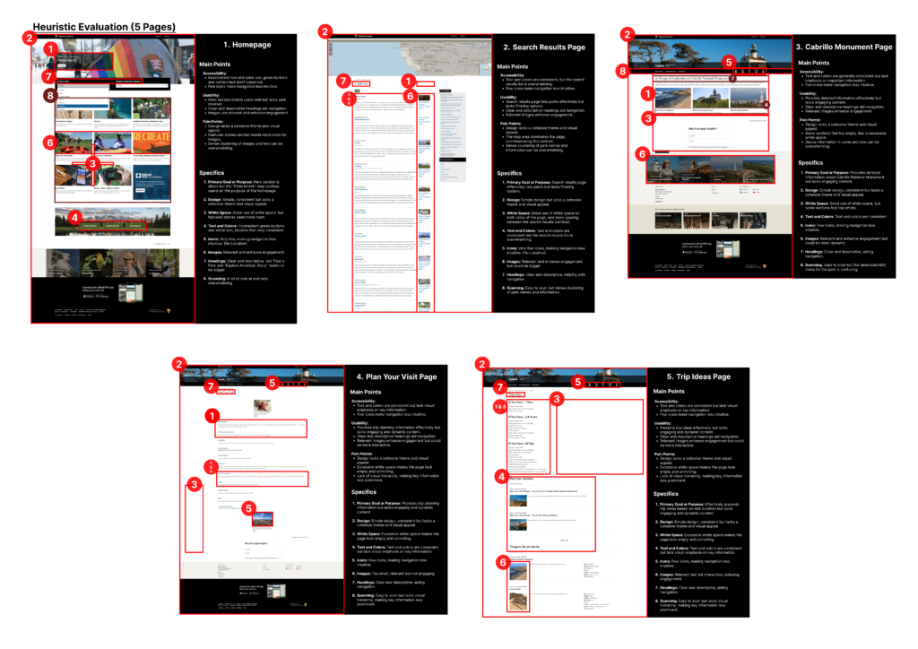
Homepage
- Main Issues: Inconsistent navigation, overwhelming image layouts, and poor accessibility in button contrast.
- Pain Points: Users may struggle with visual clutter and difficulty finding core information quickly.
Search Results Page
- Main Issues: Search results lacked cohesion, with inconsistent design elements and redundant information.
- Pain Points: Users may find it hard to scan results effectively, leading to frustration in finding relevant content.
Plan Your Visit Page
- Main Issues: Lack of a cohesive layout and unclear section headers, causing confusion in accessing trip planning information.
- Pain Points: Users might struggle to plan visits efficiently, which could deter them from further engagement with the site.
Trip Ideas Page
- Main Issues: Minimal CTAs, poor spacing, and limited content categorization, leading to a disorganized presentation.
- Pain Points: Users could have difficulty finding specific trip ideas, potentially decreasing satisfaction and engagement.
Research & Insights
Research Objective
The goal of the research phase was to uncover user pain points, motivations, and essential design elements that would enhance the NPS website’s usability, accessibility, and emotional engagement for a diverse audience.
User Interviews
I conducted in-depth user interviews with a variety of visitors to understand their expectations, frustrations, and needs when using the NPS website. This research helped shape a user-centered approach for the redesign.
Key Findings
- Cluttered User Experience: Users felt overwhelmed by excessive content and unclear navigation paths.
- Emotional Disconnect: The site lacked an engaging, inspirational tone, affecting users’ excitement about visiting parks.
- Accessibility Issues: Visitors reported difficulties accessing the site on mobile or with accessibility tools, which limited the inclusivity of the experience.
- Need for Simplified Navigation: Users wanted clear, easy-to-follow paths to find information and services related to park visits.
How These Insights Guided Design
- Simplified Navigation: Created a clean, straightforward layout to make essential park information accessible and intuitive.
- Engaging Storytelling: Incorporated high-quality imagery and emotive design elements to foster a connection with users, enhancing their desire to explore.
- Responsive Design: Ensured the site was fully responsive, making it accessible and user-friendly on mobile devices for on-the-go visitors.
- Clear Calls-to-Action: Integrated prominent buttons and clear prompts, guiding users to plan visits, explore resources, and connect emotionally with the park experience.
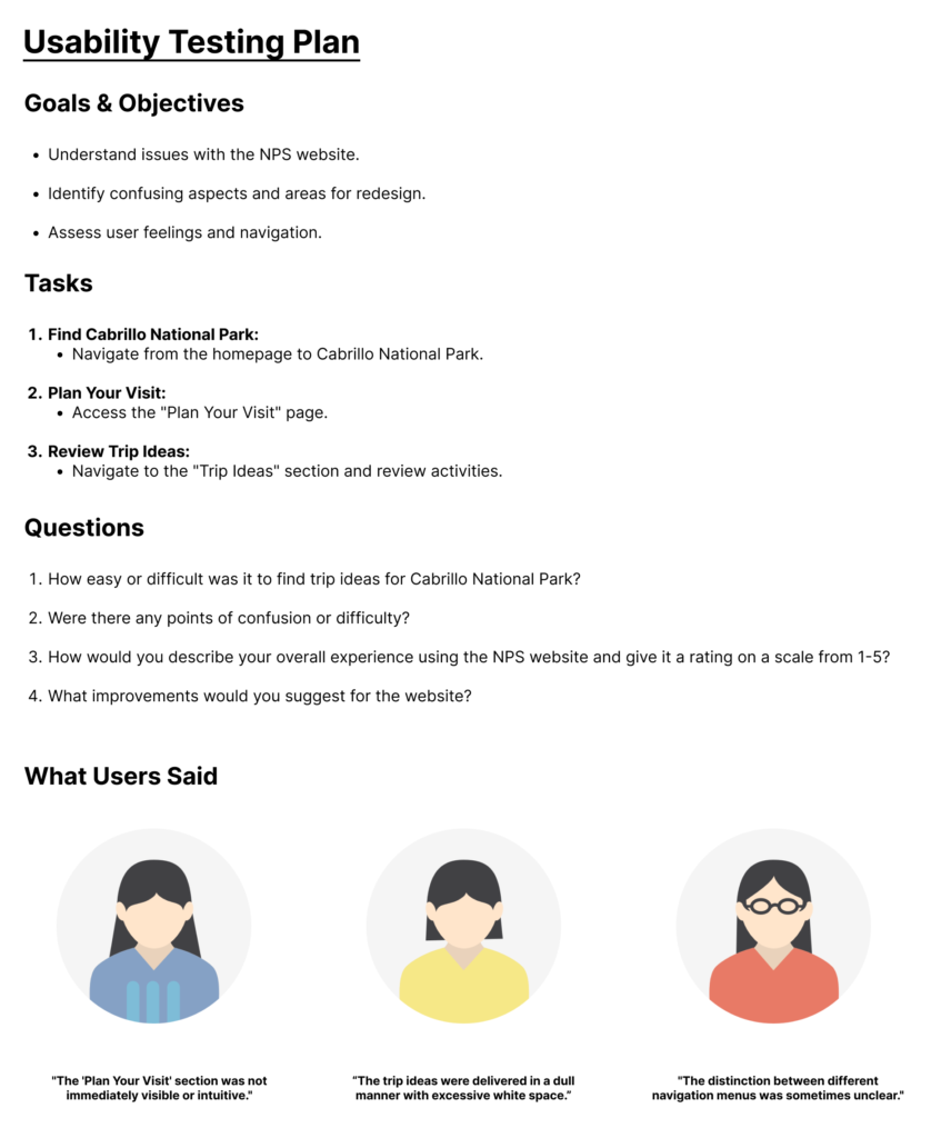
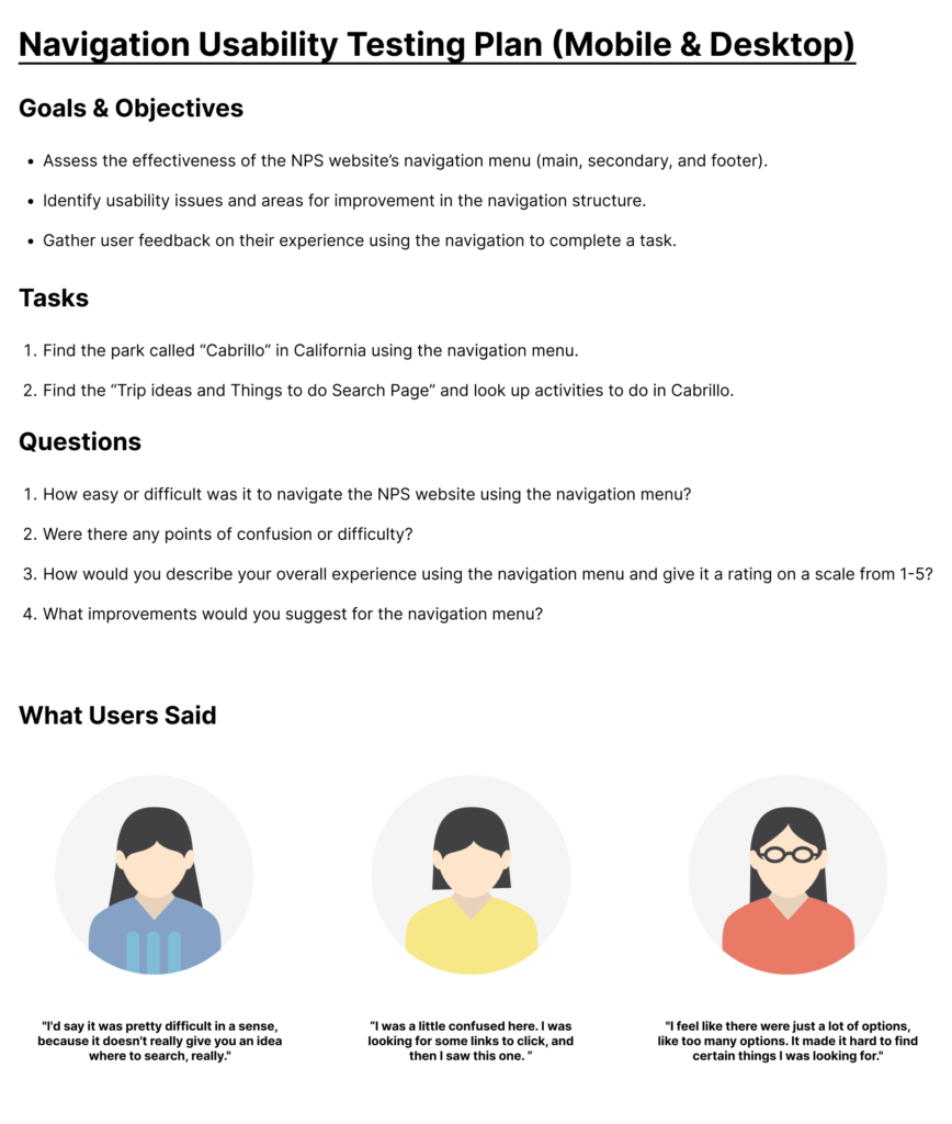
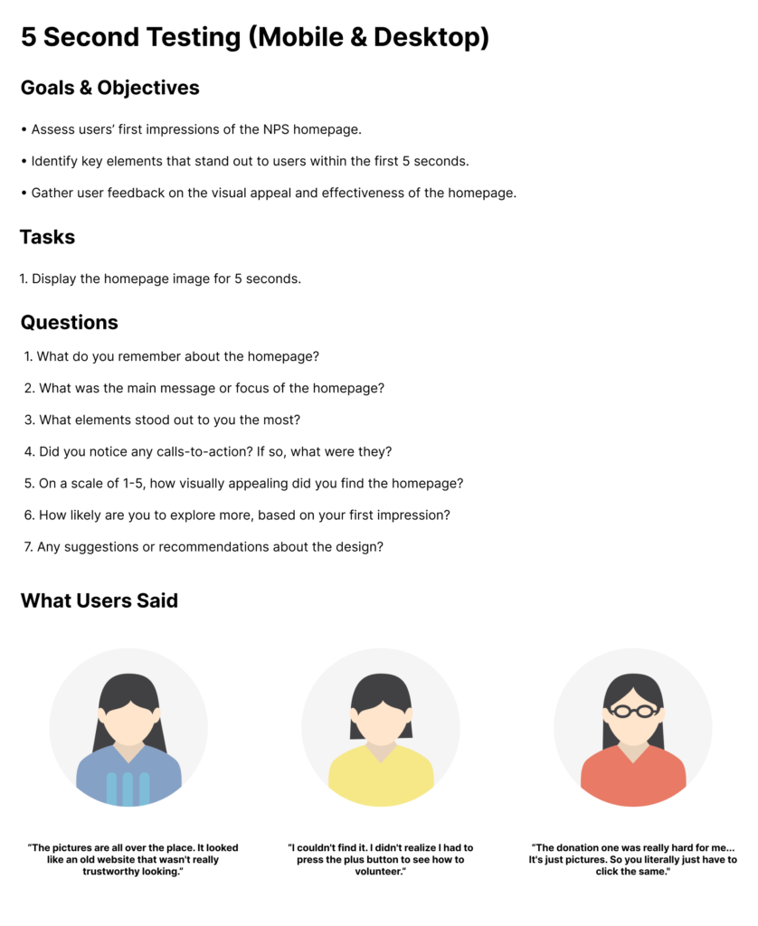
Testing the Original Website
Testing the Original Navigation
Quick Scan of the Original Website
Turning Data into Personas & Journeys
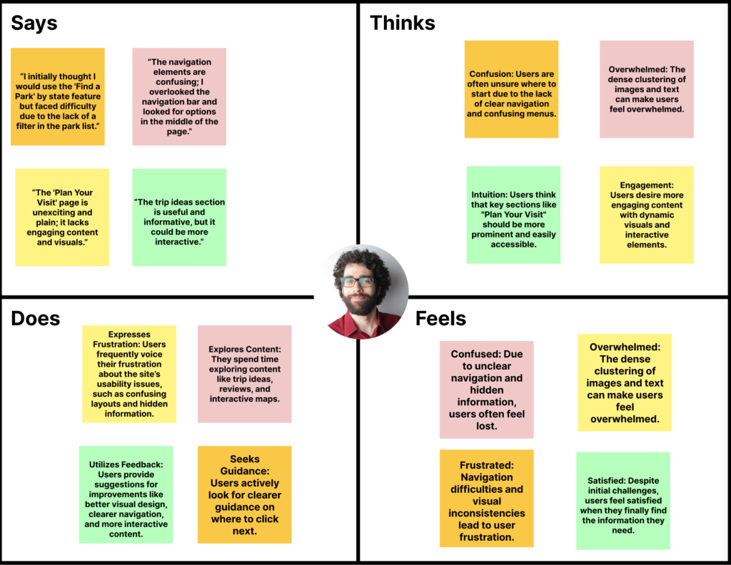
After completing user research, I translated key insights into comprehensive personas, empathy maps, and a user journey map. These tools were essential for understanding the core needs, behaviors, and emotional states of NPS website users, including individuals like Liam Payne, who represent a typical national park visitor.
Liam Payne - User Persona
The persona for Liam Payne was crafted using qualitative data from user interviews. Liam represents a tech-savvy visitor motivated by a passion for exploring nature and engaging in outdoor activities. His persona ensured that design decisions aligned with real user needs.

Empathy Maps
Empathy maps were created to capture what users like Liam see, hear, feel, and think while interacting with the NPS website. By focusing on Liam's emotional journey, the design process became centered around empathy-driven solutions that addressed his pain points.
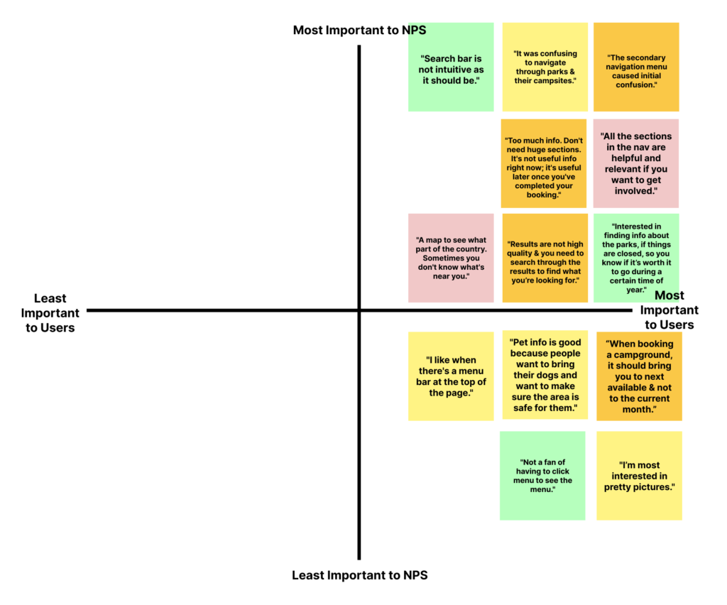
Priority Matrix
To prioritize design improvements, I developed a priority matrix based on user and NPS needs. This matrix highlighted essential areas where redesign efforts could have the most impact on user satisfaction and operational effectiveness.
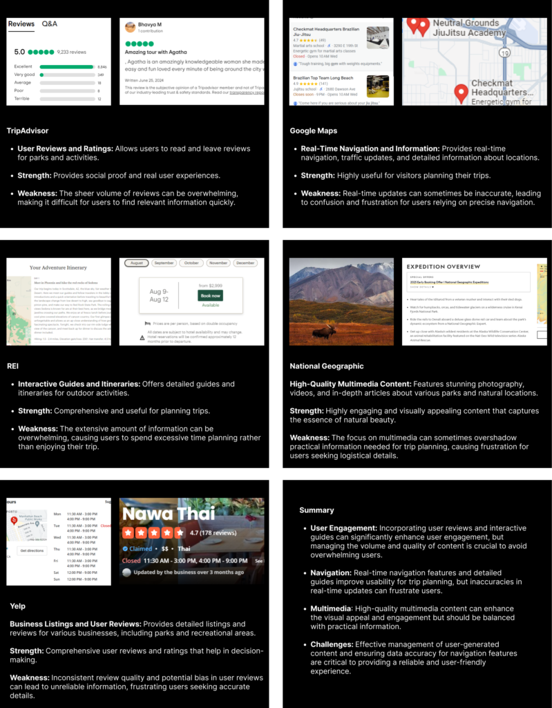
Competitor Feature Analysis
Competitors like TripAdvisor, Google Maps, REI, National Geographic, and Yelp provide valuable features such as user reviews, real-time navigation, interactive guides, and high-quality multimedia content. These elements enhance user engagement and planning ease but also pose challenges. Managing information overload, ensuring navigation accuracy, and balancing multimedia with practical details are crucial to creating a user-friendly and reliable digital experience.
Turning Insights into Statements
User Insight Statement
Users like Liam often struggle to find well-organized, accessible information about national parks. They value clear navigation and practical resources but feel discouraged when information is cluttered or difficult to access, especially on mobile devices.
How Might We?
How might we design a website that offers seamless navigation, visually engaging content, and easy access to essential park information to inspire users like Liam and support their trip planning process?
User Impact Statement
By creating a streamlined, accessible, and visually immersive experience, users like Liam are more likely to feel inspired and prepared for their park visits. This user-centered approach enhances their connection to the parks and encourages repeat visits and engagement with conservation efforts.
Building a Consistent Visual Identity
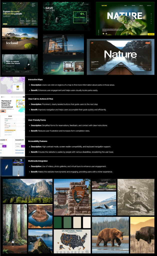
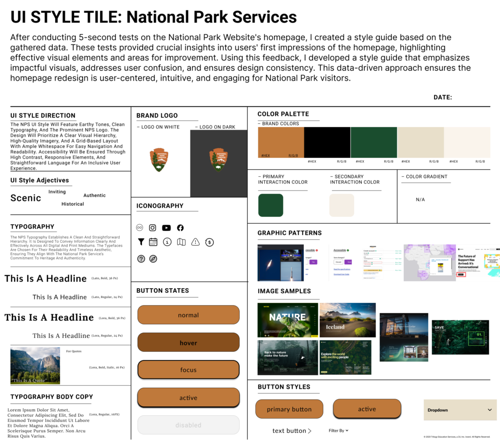
Color Palette
Here’s a Building a Consistent Visual Identity section that combines details from both the style guide and moodboards: Building a Consistent Visual Identity Color Palette. The color palette was chosen to reflect the natural beauty and diversity of the National Parks, using earthy tones to create a calming and immersive experience. This palette helps users feel connected to the parks, evoking the tranquility and grandeur of nature.
Typography
The typography selection focused on readability and accessibility, using clean, legible fonts that align with the NPS’s educational and inclusive values. This choice not only enhances user experience but also reflects the timeless, professional tone associated with the National Park Service.
Imagery and Graphics
Drawing inspiration from the moodboards, the imagery includes high-quality photographs of landscapes, wildlife, and iconic park landmarks. These visuals were carefully selected to capture the essence of the National Parks, making the digital experience feel as close to a real visit as possible. The graphics complement the content, adding a dynamic layer that encourages exploration.
UI Patterns and Visual Elements
Incorporating interactive maps, clear call-to-action buttons, and multimedia elements from the style guide ensures consistency across the site. These design patterns enhance usability while maintaining a visually cohesive look that resonates with both the NPS’s mission and user expectations.
Mood boards (UI Samples and Inspiration)
NPS Style Guide
Website Mockups & Iteration Process
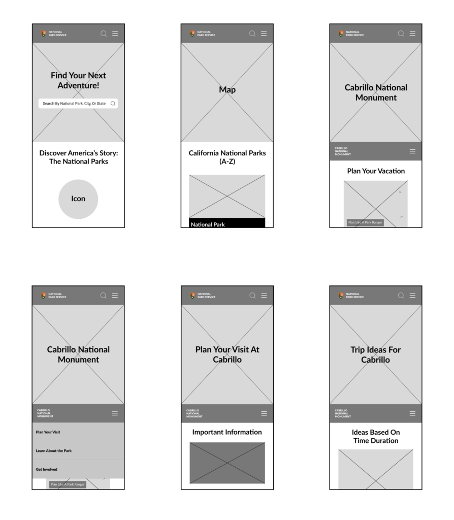
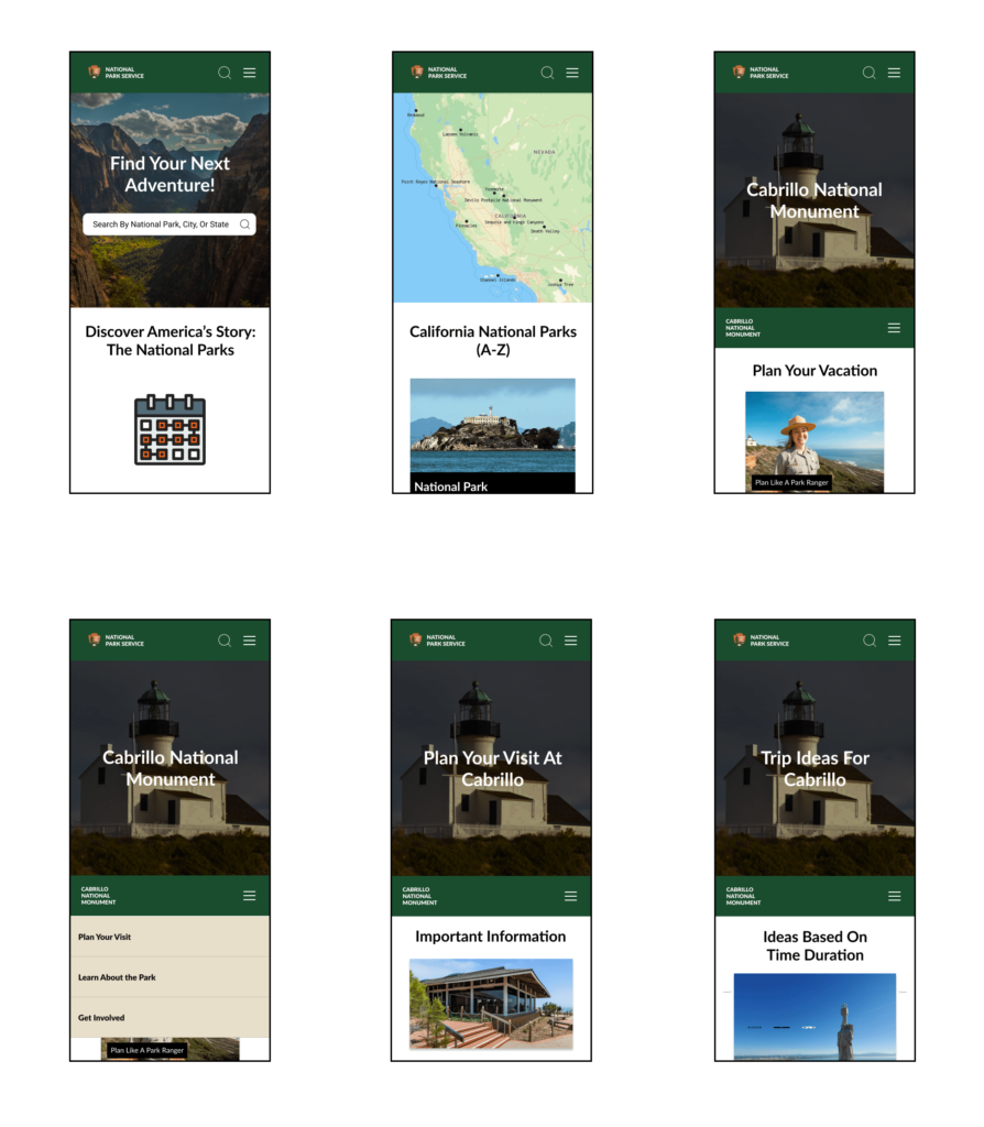
From the insights gathered during research, I understood that users like Liam needed an easy, intuitive way to access park information and plan their visits. They prioritized simplicity, visual appeal, and seamless navigation without overwhelming content. To address these needs, I developed a series of mockups, starting with low-fidelity wireframes and progressing to high-fidelity prototypes, both for mobile and desktop versions. The iterative design process involved creating clear, user-friendly layouts that guided users towards essential actions like trip planning and trail exploration. Throughout each iteration, I refined the user experience by incorporating feedback, ensuring the final design was engaging, accessible, and aligned with the National Park Service’s mission. Throughout the iteration process, I ensured the design featured strategically placed calls-to-action (CTAs) that guided users seamlessly through the site, building trust and reducing barriers to engagement.
Lo-fi Mockups (Mobile)
Hi-Fi Mockups (Mobile)
Lo-fi Mockups (Desktop)
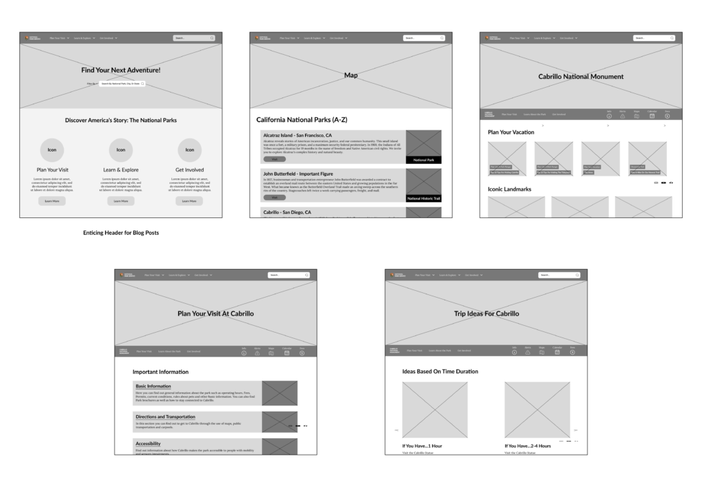
Hi-Fi Mockups (Desktop)

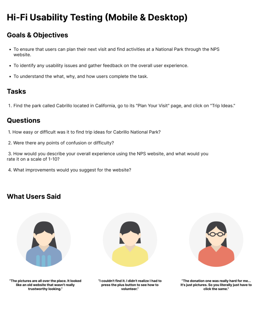
Hi-fi Usability Testing
The high-fidelity usability testing aimed to validate the final design by observing real users as they navigated key tasks, such as finding trip ideas and accessing park information. This testing was essential to identify remaining usability issues, assess overall user satisfaction, and gather feedback on the design’s effectiveness. By understanding user challenges and pain points, the testing informed last-minute refinements to ensure a seamless, intuitive experience that supports users' needs in planning park visits.
Iterated Style Guide
Based on insights from usability testing and research, the style guide was refined to enhance usability and align with user expectations. The color palette was adjusted to include earthy tones, resonating with the natural beauty of the parks while ensuring high contrast for accessibility. Typography choices prioritize readability, with a clean and professional look that complements the National Park Service’s educational mission. Iconography and controls were simplified to improve navigation clarity, making interactions intuitive across devices. These adjustments create a cohesive, user-friendly design that aligns with the NPS’s brand and accessibility goals.

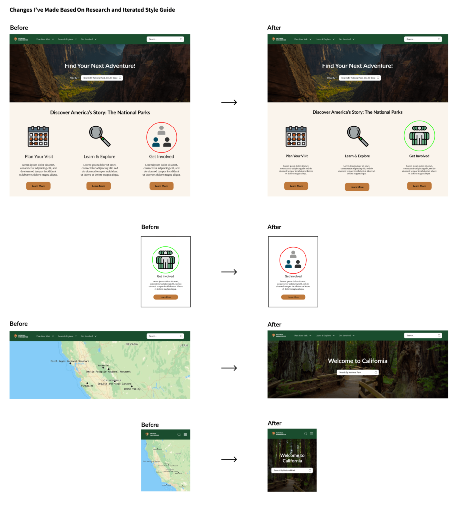
Changes I’ve Made Based on Research and Iterated Style Guide
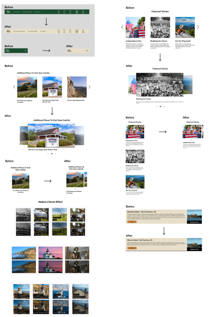
Based on user feedback, key design changes were implemented to improve accessibility, clarity, and engagement. The color palette was refined for contrast and readability, enhancing accessibility for all users. Navigation was simplified to help visitors find information quickly, while the homepage layout was adjusted to highlight essential actions like trip planning. Interactive elements, such as hover effects, were added to make exploration more intuitive. Typography and iconography were standardized for a cohesive, user-friendly experience, aligning the design closely with user needs and NPS’s mission.
First Half
Second Half
Final Design
The final design of the National Park Service website reflects a user-centered, accessible, and visually engaging experience based on thorough research and iterative improvements. The refined color palette and standardized typography ensure readability and aesthetic cohesion, while simplified navigation guides users intuitively through essential information and trip-planning resources. Key interactive elements, such as responsive buttons and hover effects, provide an engaging exploration process. Each design choice aligns with the NPS’s mission to make national parks accessible and welcoming to all, creating a digital space that captures the beauty and utility of the parks.

What I Learned
This project underscored the importance of user-centered design, especially in creating accessible, intuitive experiences for a diverse audience like the National Park Service’s visitors.
Conducting user research and usability testing taught me to translate user feedback into meaningful design changes, ensuring that each iteration truly met user needs. I also learned the value of balancing aesthetics with functionality, crafting a visually engaging site that remains easy to navigate and accessible to all users.
Working independently, I embraced the iterative process, using each research insight to refine the design and solve real user challenges. This experience reinforced my belief in the power of design to not only enhance user experience but also foster a deeper connection to the mission of the organization—in this case, inspiring people to connect with nature.
The Impact I Made
1. Created an accessible, visually cohesive website that enhances user experience for planning national park visits.
2. Improved navigation and usability, making it easier for users to find information on parks, trails, and visitor resources.
3. Enhanced mobile responsiveness, ensuring a seamless experience for users on the go.
4. Increased engagement by adding interactive features, encouraging users to explore park content.
5. Strengthened NPS’s digital presence by aligning the design with brand values and user expectations.
6. Delivered a design that supports the National Park Service’s mission to make parks accessible and inspiring to all visitors.
